Product Designer
Case Study • 2026
I led design for Focaldata AI, shaping the product's core user experience, brand identity, and visual system from zero to launch.

Focaldata AI is a multi-agent system enabling researchers at large corporations to self-serve research projects end-to-end—from conception and creating a discussion guide, through running AI-powered interviews, to generating comprehensive reports.
This was an opportunity to design something entirely new from the ground up. A chance to explore fresh paradigms for multi-agent systems, invent new patterns for AI-native research tools, and bring a product to life that hadn't existed before.
Jump to section
Existing Mental Models for a New Medium
The first phase was deeply understanding researcher workflows whilst combining with what was emerging within AI tools and multi-agent products. In early 2025, reasoning models had just come out and multi-agent systems were just beginning to emerge.
Design Directions
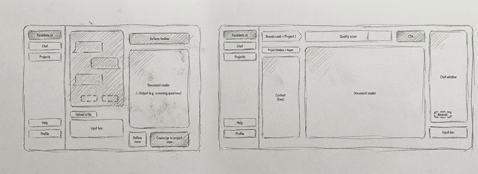
Three Panel Exploration
Explored a Cursor-inspired three-panel system with files on the left, working file in the middle, and agent on the right—mimicking a right-hand toolbar approach.
Two Panel Solution
Landed on a two-panel view: chat on the left, artifacts on the right. This aligned with familiar mental models from email and desk workflows.
Problem + Requirements
People's mental models were anchored in Google Docs and Microsoft Office, but we wanted to take them into a more AI-powered experience. The challenge was finding how to best place this multi-agent system where it felt both familiar and revolutionary.
→ Chat Panel (Left)
- • Scrappy, email-thread style conversation
- • Full history for trust-building
- • Agent communication hub
- • Project guidance & suggestions
→ Artifacts Panel (Right)
- • Formalized nature of work
- • Project context & goals
- • Discussion guides & transcripts
- • Reports & deliverables
The Two Panel Mental Model
We wanted to mimic the physical mental model that people would have whilst working on research. This draws from two familiar paradigms:
The Desk Metaphor
Imagine your physical desk: you have your formal documents and computer screen for professional work, and your notepad on the side for scribbles and scrap writing. Left is scrappy, right is formal.
The Email Metaphor
Research projects typically happen via email threads with agencies—conversations on one side, attachments and formal documents on the other. We're combining Gmail, Outlook, and the Office suite.
Defining the North Star
Early on, we had to make a critical product decision: optimize for quick generations (discussion guides, audience specs, quick analyses) or end-to-end project completions?
Option A: Quick Generations
Optimize for speed, suggest artifacts, get quick outputs. Users generate pieces but may not complete full projects.
Option B: End-to-End Completion ✓
Create continuous flow from project start to report delivery. This is what pays the bills—completed projects generate revenue.
We chose end-to-end completion, which shaped the entire UX. After launching a project, we encourage monitoring fieldwork, viewing insights, and getting email notifications. The product guides users through the complete research journey rather than just quick outputs.
Stretching AI Prototypes to Their Limits
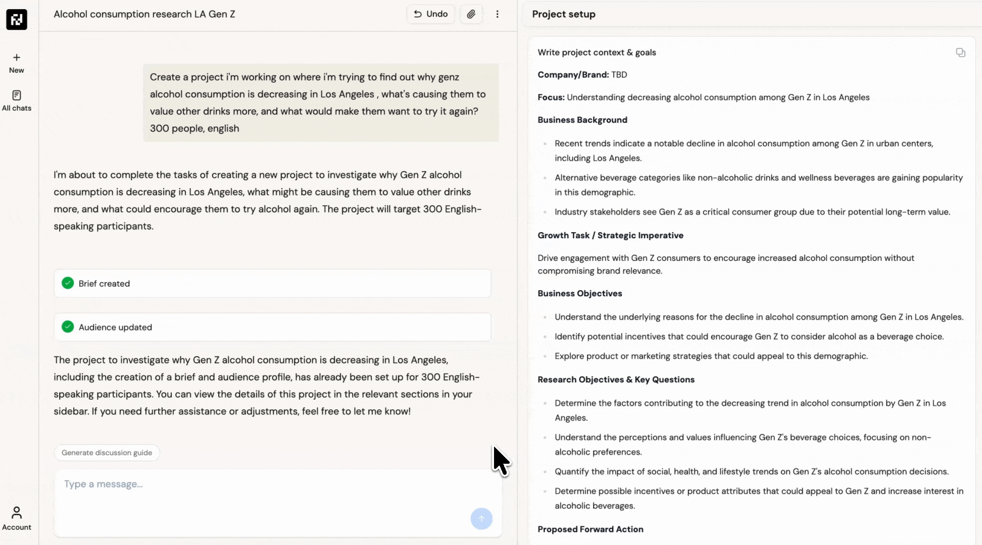
I wanted to test how far we could push new AI tools for external validation before building the real platform. Using Claude Code, I created an end-to-end JavaScript prototype that went far beyond traditional Figma mockups.
12-15
Hours of prompting
12+
User interviews
80%
Platform fidelity
Explore the Claude Code Prototype
Visit the live prototype used for user testing and external validation
What the prototype included:
- Full URL users could visit and explore freely
- Hard-coded example responses mimicking real LLM output
- Real project example (Gen Z alcohol study)
- Complete discussion guide with AI-generated questions
- Simulated fieldwork insights and transcripts
- Full report generation simulation
- Login/logout functionality
- End-to-end research project simulation
The richness of content made the prototype feel incredibly real. We interviewed people from Canva, Estée Lauder, and other companies—giving them a full URL to explore freely, almost like contextual inquiry.
This de-risked the UX 4-5 months before the actual platform would exist. We built confidence internally and gathered evidence that users would resonate with this new two-panel experience.
Visual Style: Parchment & Scholarly
Inspirations came from ChatGPT canvas, Claude artifacts, Manus, and Repl.it—but we needed something less complex for researchers who aren't tech-savvy. The theming landed on a parchment, paper-like feel: a bit scholarly and academic whilst keeping minimal so content takes center stage.
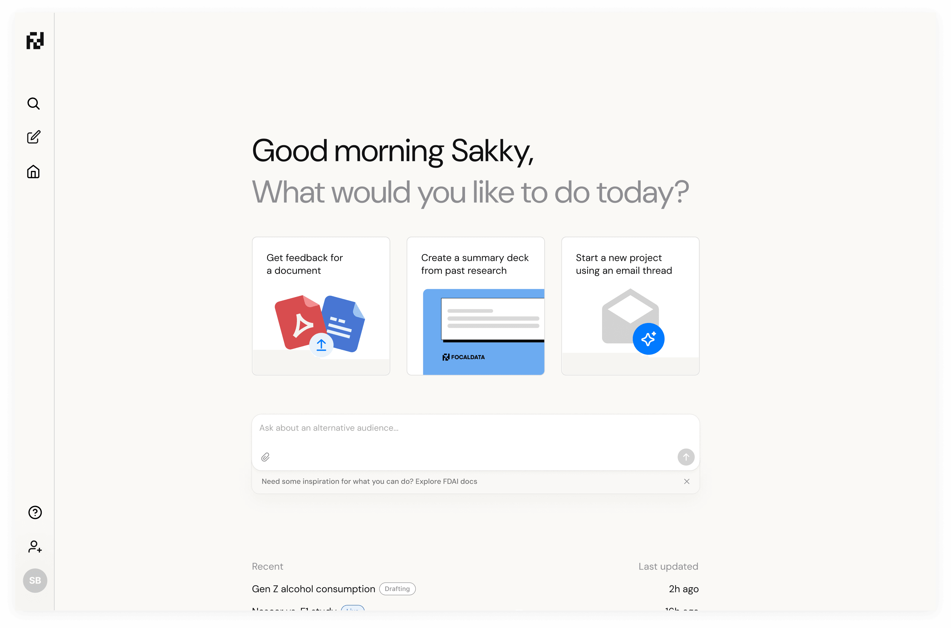
The parchment theme brings a scholarly feel whilst keeping the interface minimal and content-focused
Designer to Developer: Submitting PRs
As we approached launch, I started submitting PRs directly on the frontend. This became a powerful workflow setup with Conductor, Claude Code, and Cursor—where I could supplement developers building complex infrastructure whilst adding finishing touches to the UI.
Tailwind Setup
Setting up Tailwind classes properly for the parchment theming and consistent styling across components.
Typography & Theming
Font changes and parchment styling that gave the platform its scholarly, academic feel.
New Functionality
Introducing features like the carousel with illustration and iconography for onboarding.
This workflow meant I wasn't just designing in Figma and handing off—I was directly contributing to the codebase, making everything feel polished and complete whilst developers focused on the complex multi-agent infrastructure.
The Virtuous Analysis → Iteration Loop
Post-launch, we created a powerful feedback loop: watch session replays, note insights, submit quick fix PRs. This cycle accelerated dramatically when we introduced AI into the analysis pipeline.
I introduced PostHog into the platform and used Gemini to analyze dozens of hours of session recordings at scale. This surfaced insights like system status not being clear—users coming from Microsoft Office needed visual feedback when artifacts were being saved.
Eventually, we connected PostHog to Slack to send automatic session summaries. AI would analyze without human intervention, and we'd only dive deeper when something problematic or interesting was flagged.
Key Takeaways from the Journey
1. Mental Models Bridge New and Familiar
For AI-native products, anchoring to existing mental models (email threads, desk metaphors, document workflows) helps users adopt revolutionary experiences without feeling lost. The two-panel structure succeeded because it felt familiar even while introducing multi-agent capabilities.
2. AI Prototyping Changes Everything
Claude Code enabled 80-90% fidelity prototypes in 12-15 hours that would've taken weeks in Figma. More importantly, the richness of AI-generated content made user testing dramatically more valuable—contextual inquiry became possible months before the real product existed.
3. Designers Can Ship Code
With tools like Cursor and Claude Code, submitting PRs for UI polish, theming, and even new features became a superpower. This freed developers to focus on complex infrastructure while ensuring the product felt polished and complete.
4. AI-Powered Analytics Closes the Loop
Using Gemini to analyze session replays and PostHog for automated Slack summaries created a virtuous cycle: insights surfaced automatically, problems were detected early, and fixes shipped fast. Human review only happened when AI flagged something worth investigating.
5. North Star Shapes Everything
The decision between optimizing for quick generations vs. end-to-end completion shaped the entire product experience. Choosing completion meant designing for continuous flow, notifications, and guidance—fundamentally different from an artifact-generation tool.